Compendium of Alphabets:
A System of Lettershapes
WRITTEN AND DESIGNED
AT CALIFORNIA INSTITUTE OF THE ARTS, 1997—98
The Compendium of Alphabets is my graduate thesis. At the core of it is a typeface system of some rather usable fonts; additionally, I produced a little book that explains it all. Download a PDF of it here.
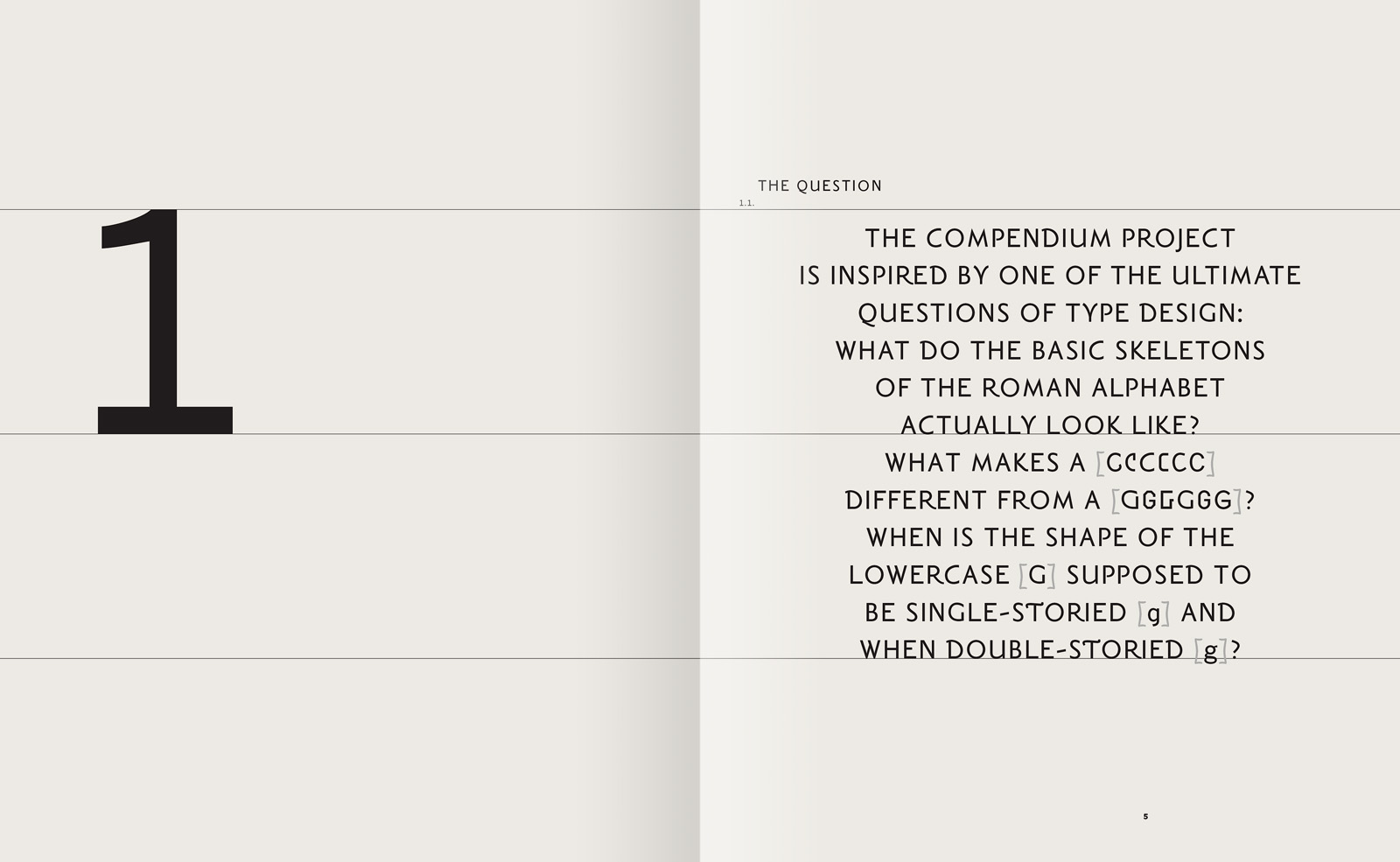
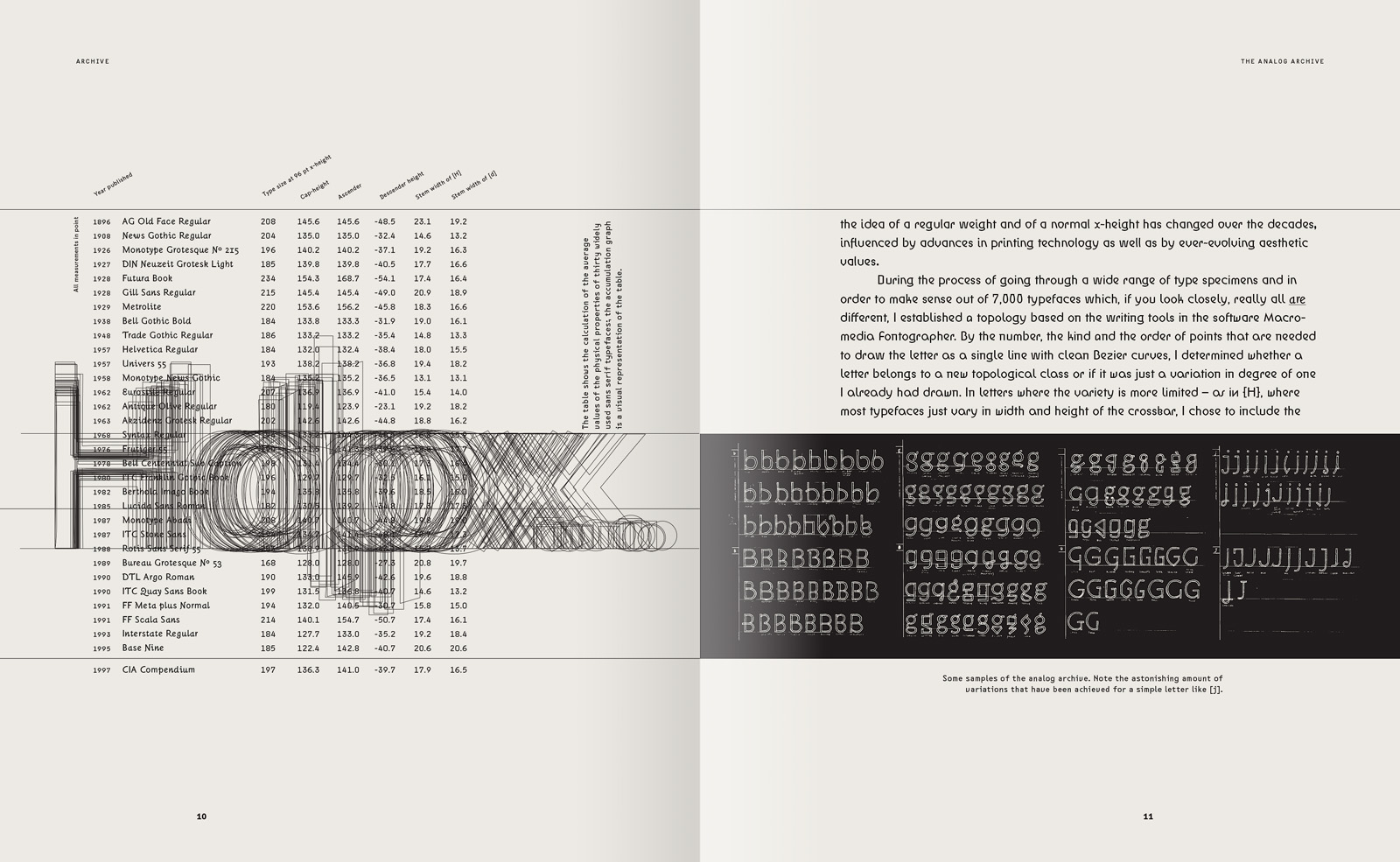
The project was inspired by one of the basic questions of Latin type design: What do the skeletons of the Roman alphabet really look like? What makes a [G] different from a [C]? Why are some lowercase [g]s double-storied and some single-storied?
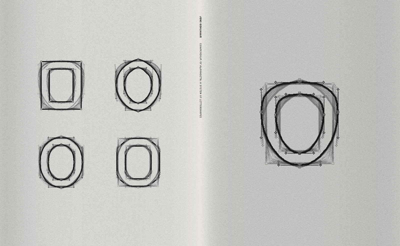
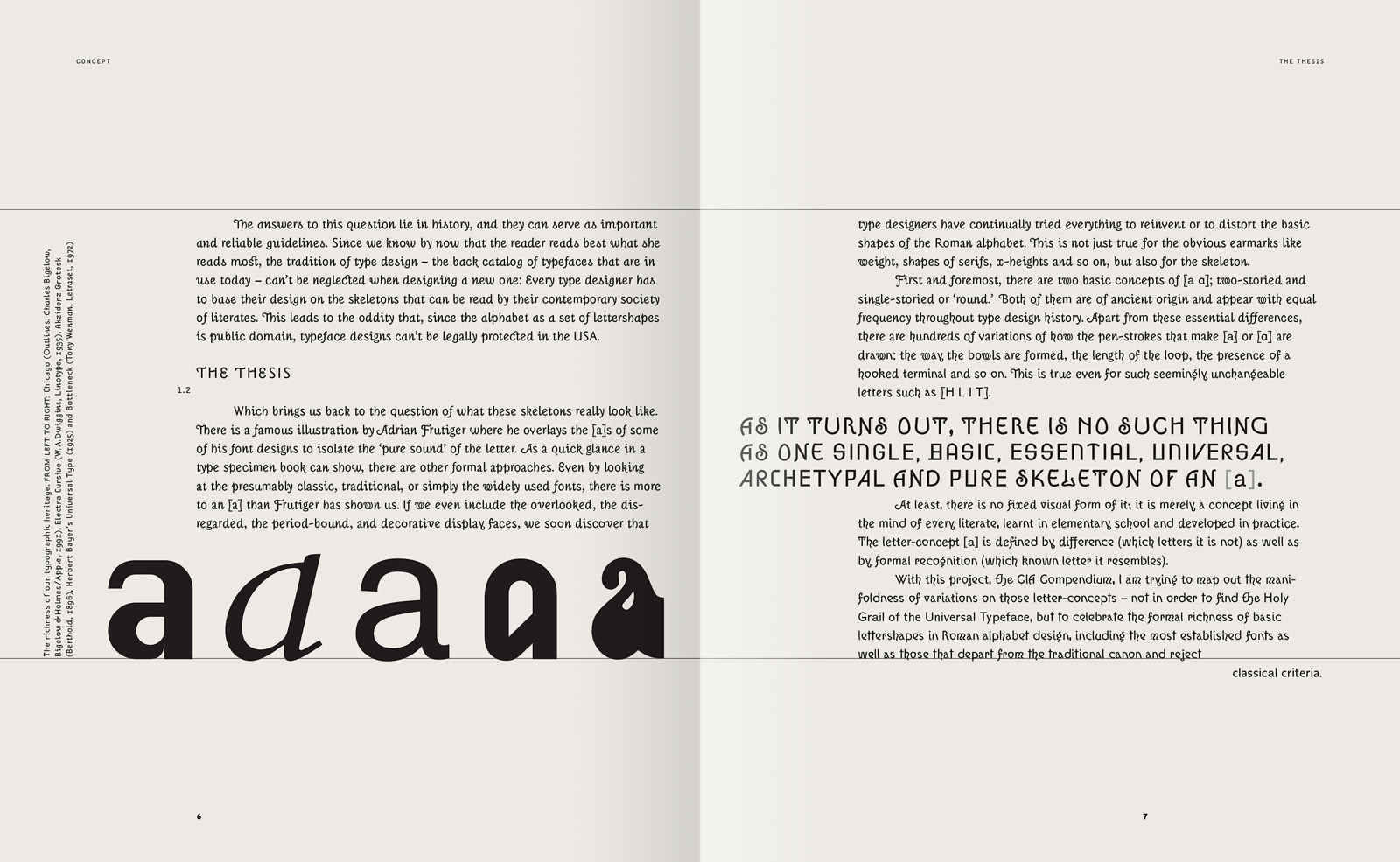
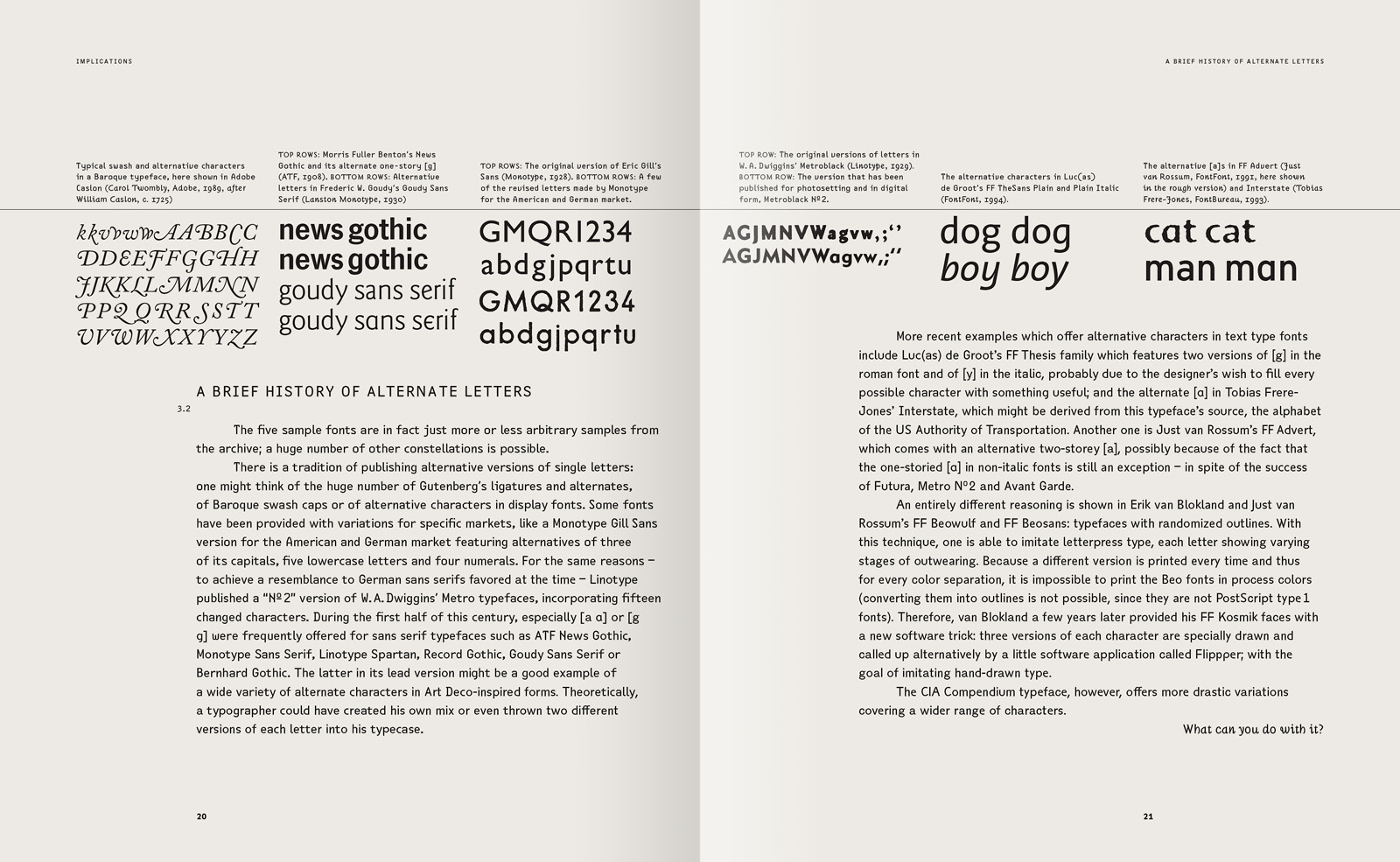
A quick glance in a type specimen book shows that, for a variety of reasons, type designers have continually tried to reinvent or distort the shapes of the Roman alphabet. This is true not only for the obvious attributes like weight, contrast, presence of serifs or decorative elements, but also for the skeletal structure. With the CIA Compendium project, I have tried to map out the variety of skeletons, not to find a universal form, but to celebrate the richness of our typographic heritage.
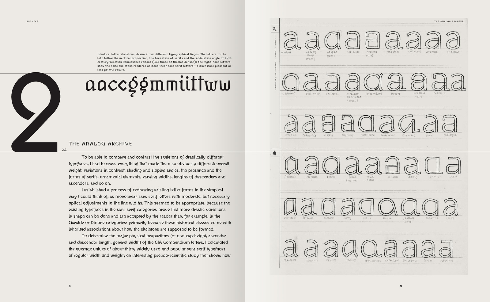
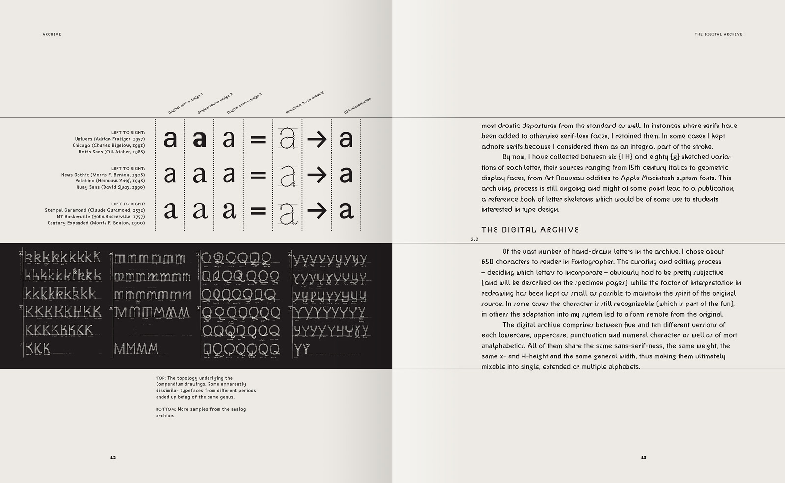
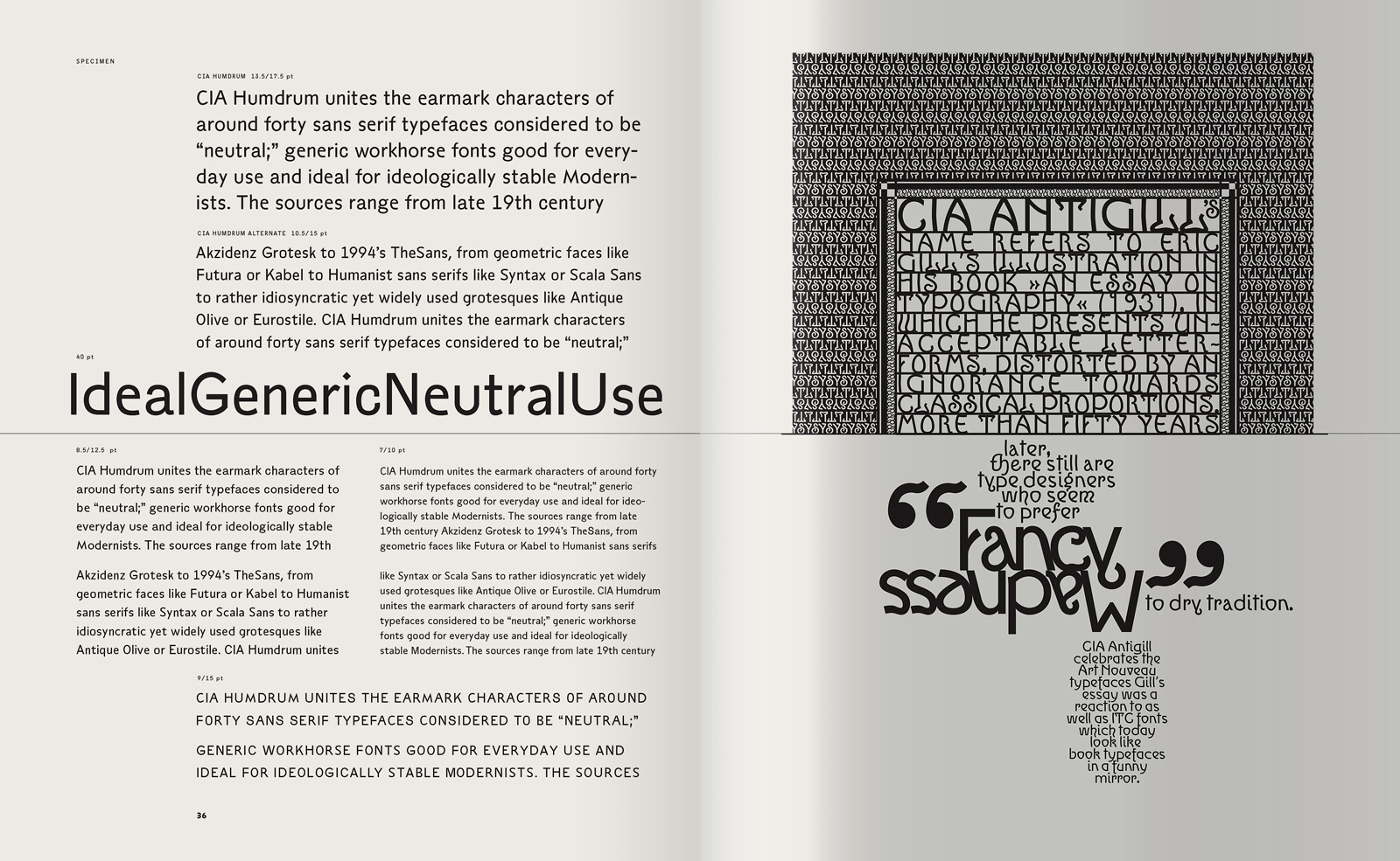
To be able to compare and contrast the skeletons of diverse typefaces, I had to remove everything that makes them obviously different. Therefore, I redrew existing letter forms as monochrome, upright sans serif letters with moderate optical adjustments to line widths. This has been a rather arbitrary decision; I just as well could have drawn them as Romantic demibold italics or as condensed slab serifs.
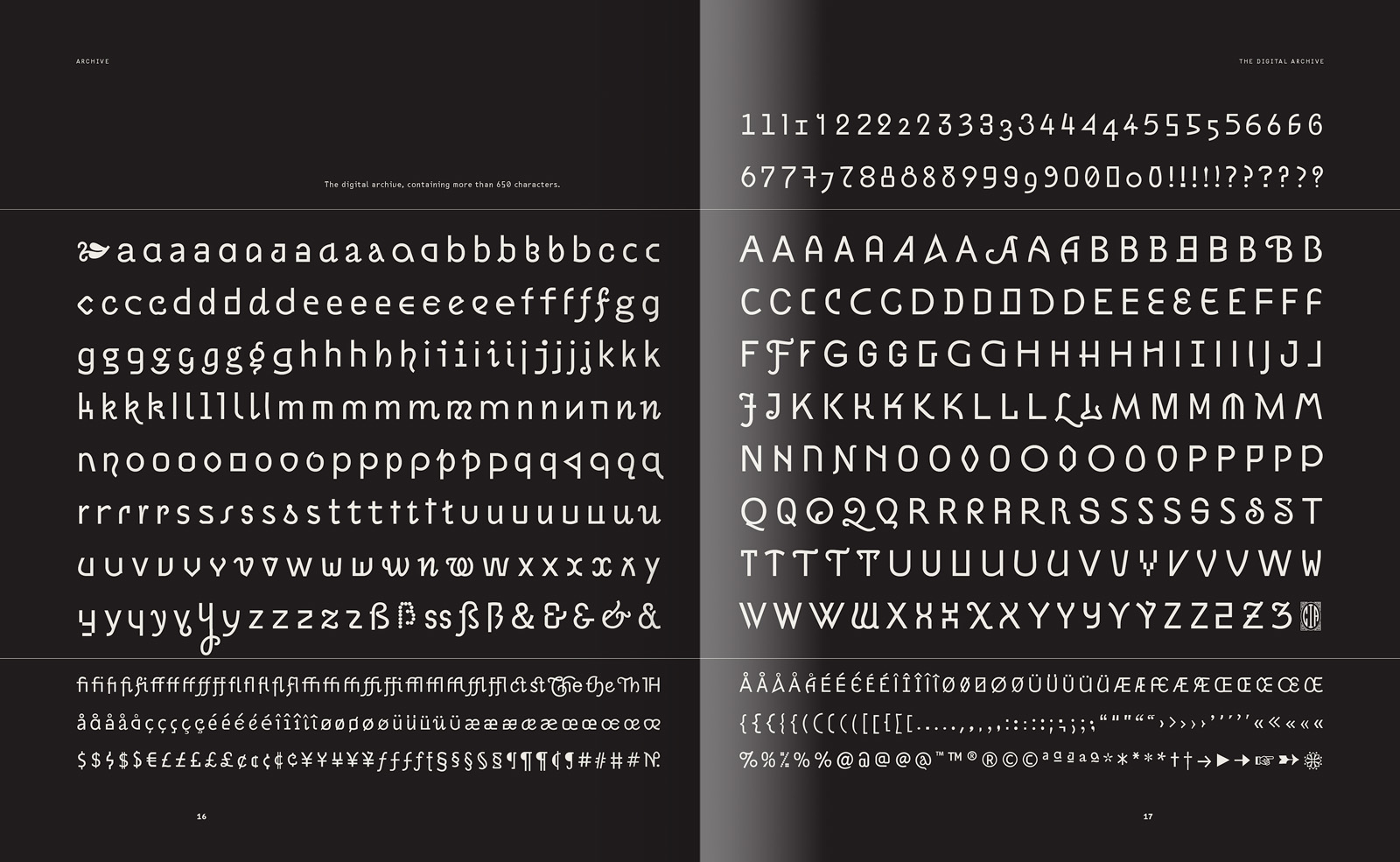
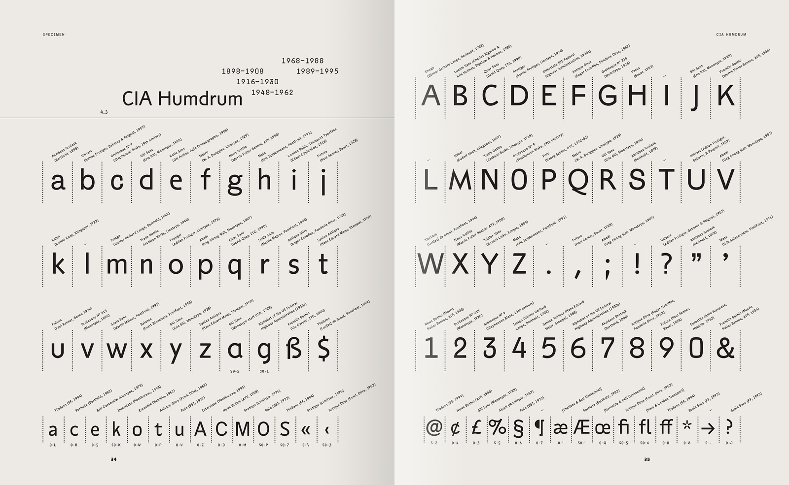
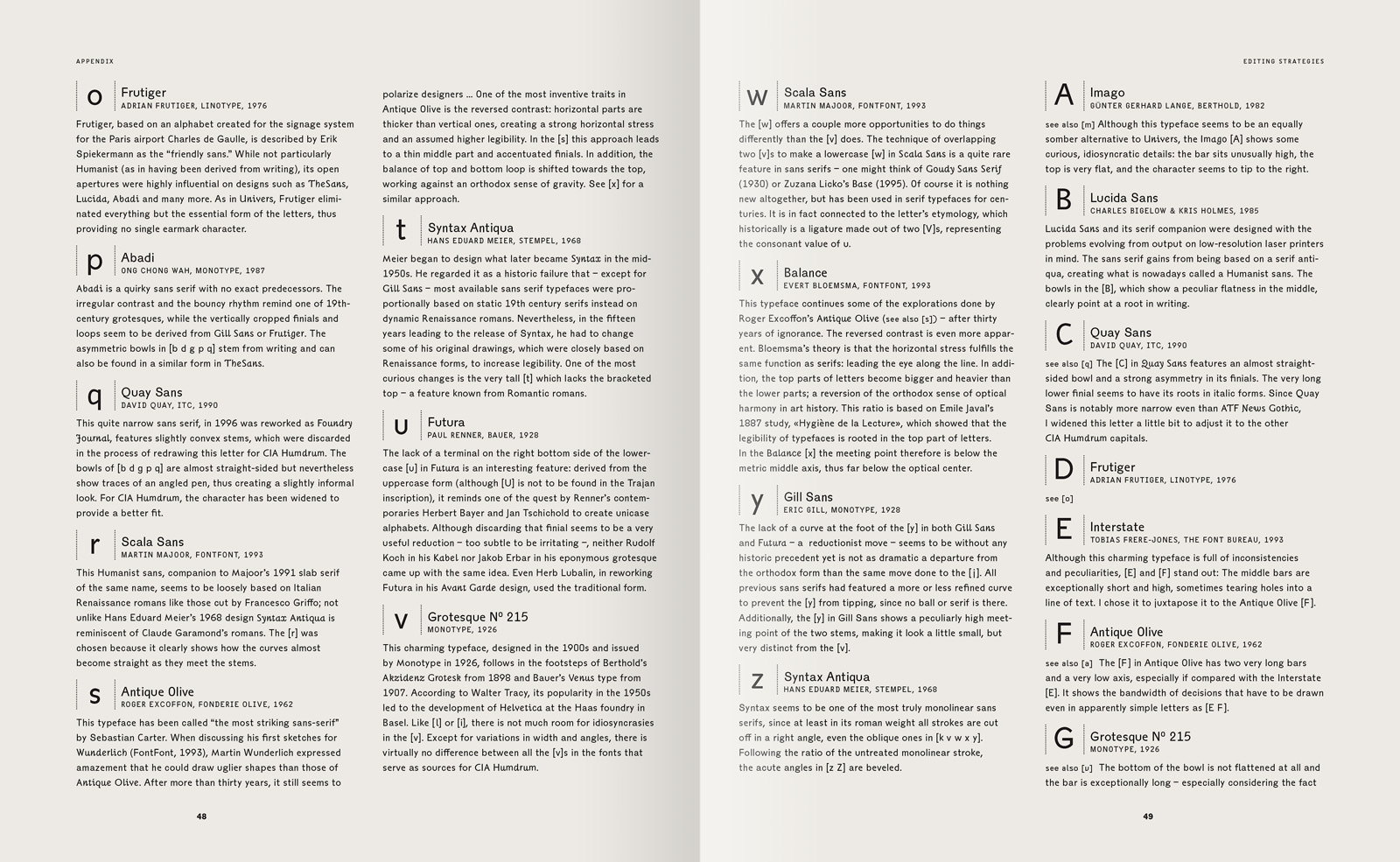
After collecting a vast number of sketches, I digitized about 700 characters, their sources ranging from 15th century italics to geometric display faces, from Art Nouveau oddities to Apple system fonts. This led to a typeface system comprised of between five and ten versions of each character. Since the characters all share the same physical proportions, they are ultimately mixable into single, extended or multiple alphabets. Beyond this, there is no other consistent thread that connects the letters: neither a formal quality caused by a writing tool, nor a set of pre-conceived rules or technical restrictions, nor the unifying power of an individual designer's expression — just a vast quantity of disparate approaches. Can this be called a typeface?
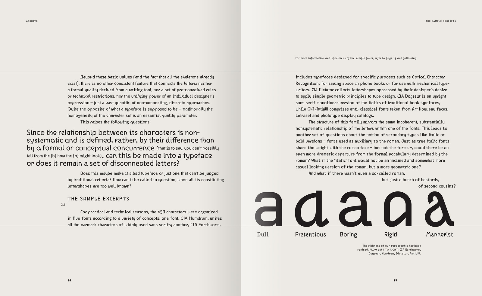
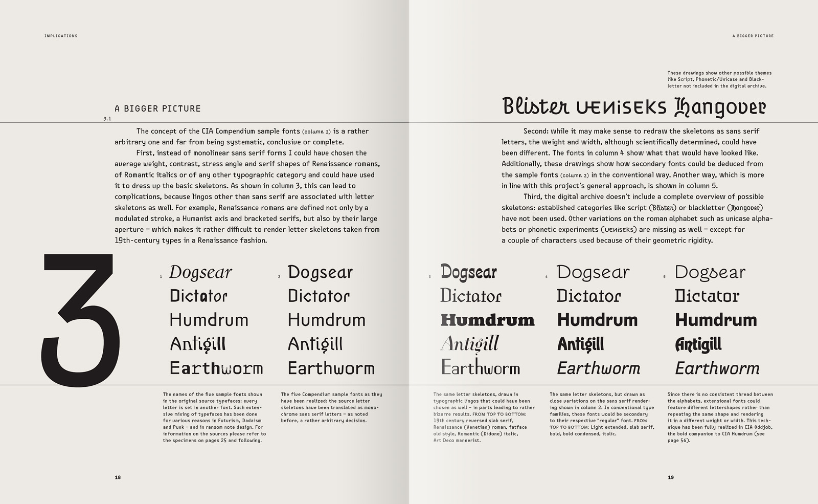
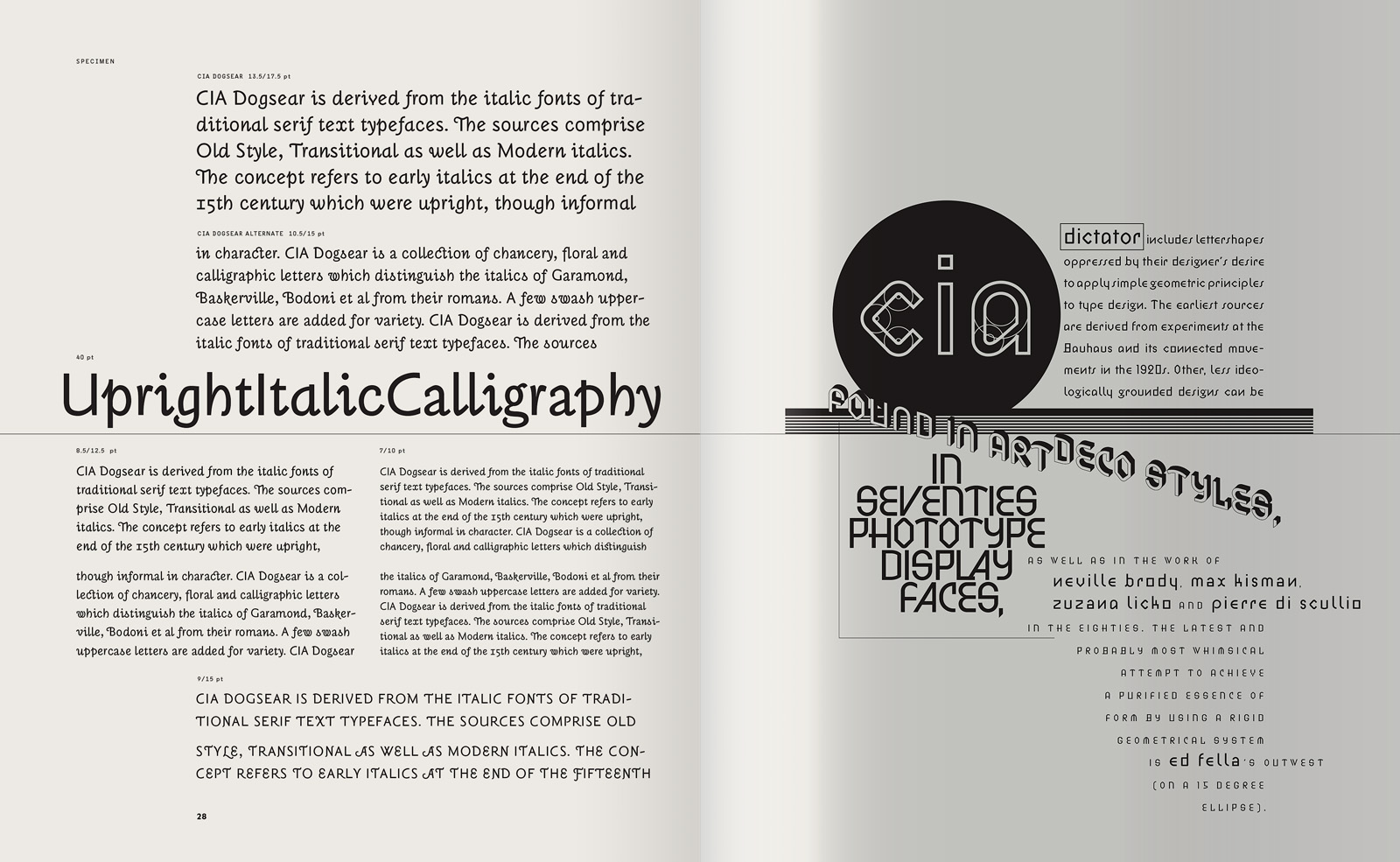
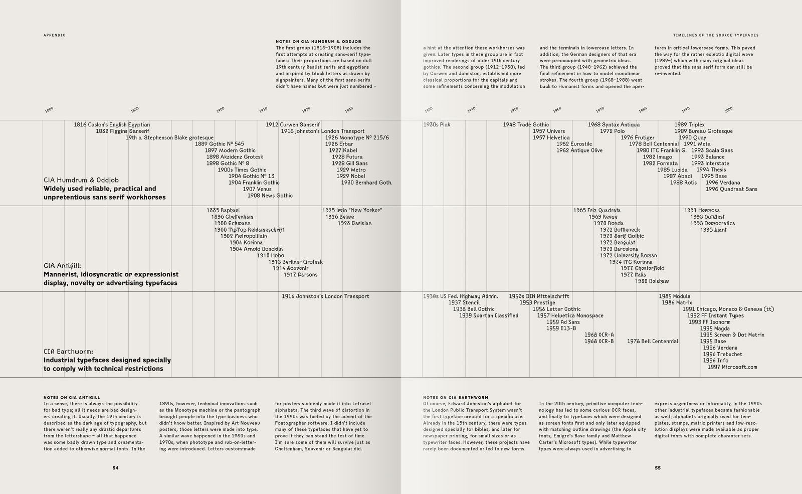
For technical and practical reasons, the 700 characters were organized in five fonts according to different strategies. CIA Humdrum unites all the earmark characters of widely used sans serifs. CIA Earthworm includes typefaces specially designed for Optical Character Recognition, space-saving printing, low-res output systems or mechanical typewriters. CIA Dictator collects lettershapes oppressed by their designer’s application of simple geometric principles. CIA Dogsear is an upright monochrome version of the italics of traditional book typefaces, while CIA Antigill is comprised of anti-classical shapes taken from Art Nouveau faces, Letraset and phototype display catalogs.
The unorthodox structure of this family leads to another set of questions about the notion of secondary types such as italic or bold. If true italic fonts share the weight with the roman, but not the forms, can there be an even more drastic departure from the formal vocabulary determined by the roman? What if the ‘italic’ font would not be an inclined version of the roman, but a more geometric one? What if there wasn’t even a so-called roman, but just a bunch of bastards, of second cousins?
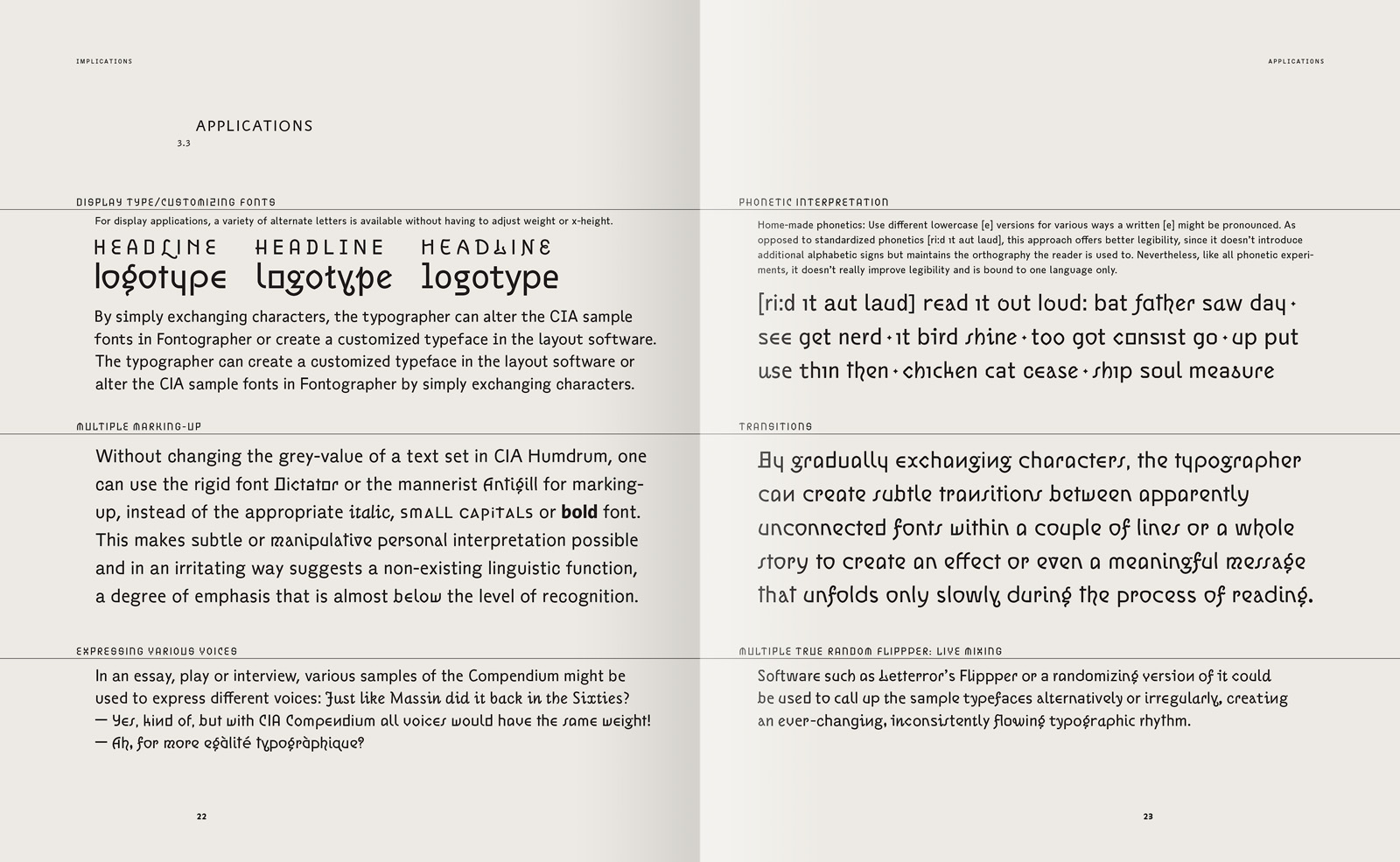
Multiple marking-up is an interesting implication of the CIA Compendium. Without changing the gray-value, one can use geometric or mannerist alphabets to suggest varying degrees of emphasis. Another obvious implication is the on-the-fly generation of alternative logotypes or headlines. Or you might exchange the characters gradually, to create subtle transitions between seemingly unconnected fonts within a couple of lines or a whole story — to embed a message that unfolds only slowly during the process of reading.
CIA Compendium is encyclopedic and historically referential. It is, if you will, a sarcastic, postmodern answer to Modernist faces like Univers or Futura, which tried to arrogantly achieve an archetypal or universal form. The CIA type, on the other hand, is radically tolerant, it attempts to be all typefaces at the same time by collecting all the idiosyncrasies. It is all over the place.
------------------------------
Writing, Design & Typography: Jens Gehlhaar
Consultation: Ed Fella, Jeffery Keedy, Lorraine Wild, Jonathan Hoefler,
Just van Rossum, Erik van Blokland
California Institute of the Arts, School of Art, Program in Graphic Design, Valencia
Award:
American Center of Design, 21st Annual 100 Show, 1998
See Compendium in use:California & Graphic Design